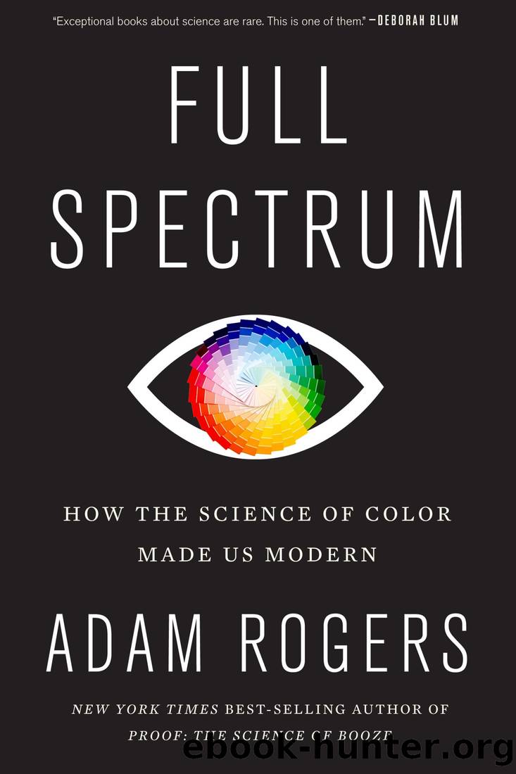
Full Spectrum: How the Science of Color Made Us Modern by Adam Rogers

Author:Adam Rogers [Rogers, Adam]
Language: eng
Format: epub
ISBN: 9781328519146
Google: NgbrDwAAQBAJ
Published: 2021-05-18T11:25:46.356000+00:00
* * *
Measuring the color of lightâwavelength or photons or color temperature, whateverâis easy. But determining what color people see is a whole other problem. Making some kind of chart, reliably and reproducibly, that everyoneâall of usâcould put a finger anywhere on or in and agree that we were pointing at a specific color that weâd all have the same name for? That turns out to be damn near impossible.
This is the problem of a field called psychophysics, and itâs a doozy. Some spectral colors inherently appear brighter than others, even when seen under the same objective amounts of light. People see the dividing lines between colors in different places. People donât even agree on what the basic colors are. Should the axes of the colorspace flow through the Newtonian spectrum, or the trichromatic red-blue-yellow? Red-green-blue? And what the hell is up with the extraspectral purple Newton invented, or any of the other colors nobody sees in a rainbow? Pink? Brown?
Those difficulties have never stopped people from trying. Even on the fundamental shape of colorspace, they disagreed. There was Tobias Mayerâs double pyramid of 1758. Philip Otto Runge painted it as spheres in 1810; Chevreul proposed a hemisphere in 1839. Christian Doppler (of the eponymous Effect) sketched one that was shaped like an eighth of a sphereâan octant. In the 1850s, attempting to reconcile Newtonâs color circle with experimental evidence ended up with a sort of upside-down, off-center horseshoe, a âbarycentric archâ with violet at the lower left and red at the lower right, and white an off-center eye in the upper right. Itâs preposterous, but the math works, so itâs the basis for official color charts people still use today.
You can see how language and color naming might trip people up in all this. As the number of pigments people could make, artificially, blew up in the nineteenth century, being able to have a common language for those colors has gotten more and more critical. Iâve never forgotten the color of paint my mom chose for our living room in the 1980sâit was Apricot Ice, a name that can conjure up precisely no actual color in your mind upon reading it. (It was sort of pastel pinkish orange.) I have no idea where to locate it in an international colorspace, but itâs somewhere out there, coordinates on all the various maps that international color industry groups and TV screen makers and textile dyers use so assiduously.
Albert Munsell was another of those poor saps who tried to build a rigorous colorspace. His was more successful than most. As an art student in Europe in 1879, Munsell was merely a competent painter, but the fact that he couldnât find a colorspace thatâd make his color theory work easier bugged him. By 1900 heâd constructed a topology that contained a color gamut with colors evenly spaced according to hue and brightness, which he called âvalue.â Over the next few years Munsell incorporated the saturation or pastel-ness of the color, a quality that he named âchroma.
Download
This site does not store any files on its server. We only index and link to content provided by other sites. Please contact the content providers to delete copyright contents if any and email us, we'll remove relevant links or contents immediately.
Sapiens: A Brief History of Humankind by Yuval Noah Harari(14412)
The Tidewater Tales by John Barth(12674)
Mastermind: How to Think Like Sherlock Holmes by Maria Konnikova(7372)
The Thirst by Nesbo Jo(6961)
Do No Harm Stories of Life, Death and Brain Surgery by Henry Marsh(6948)
Why We Sleep: Unlocking the Power of Sleep and Dreams by Matthew Walker(6737)
Life 3.0: Being Human in the Age of Artificial Intelligence by Tegmark Max(5566)
Sapiens by Yuval Noah Harari(5383)
The Body: A Guide for Occupants by Bill Bryson(5118)
The Longevity Diet by Valter Longo(5072)
The Rules Do Not Apply by Ariel Levy(4983)
The Immortal Life of Henrietta Lacks by Rebecca Skloot(4600)
Animal Frequency by Melissa Alvarez(4483)
Why We Sleep by Matthew Walker(4456)
The Hacking of the American Mind by Robert H. Lustig(4392)
Yoga Anatomy by Kaminoff Leslie(4377)
All Creatures Great and Small by James Herriot(4335)
Double Down (Diary of a Wimpy Kid Book 11) by Jeff Kinney(4286)
Embedded Programming with Modern C++ Cookbook by Igor Viarheichyk(4188)
